
GRADUATION PROJECT | PERSONAL PROJECT
May 2023 - March 2024
CATEGORIES
DESIGN RESEARCH
ART DIRECTION
LOGO
PACKAGING
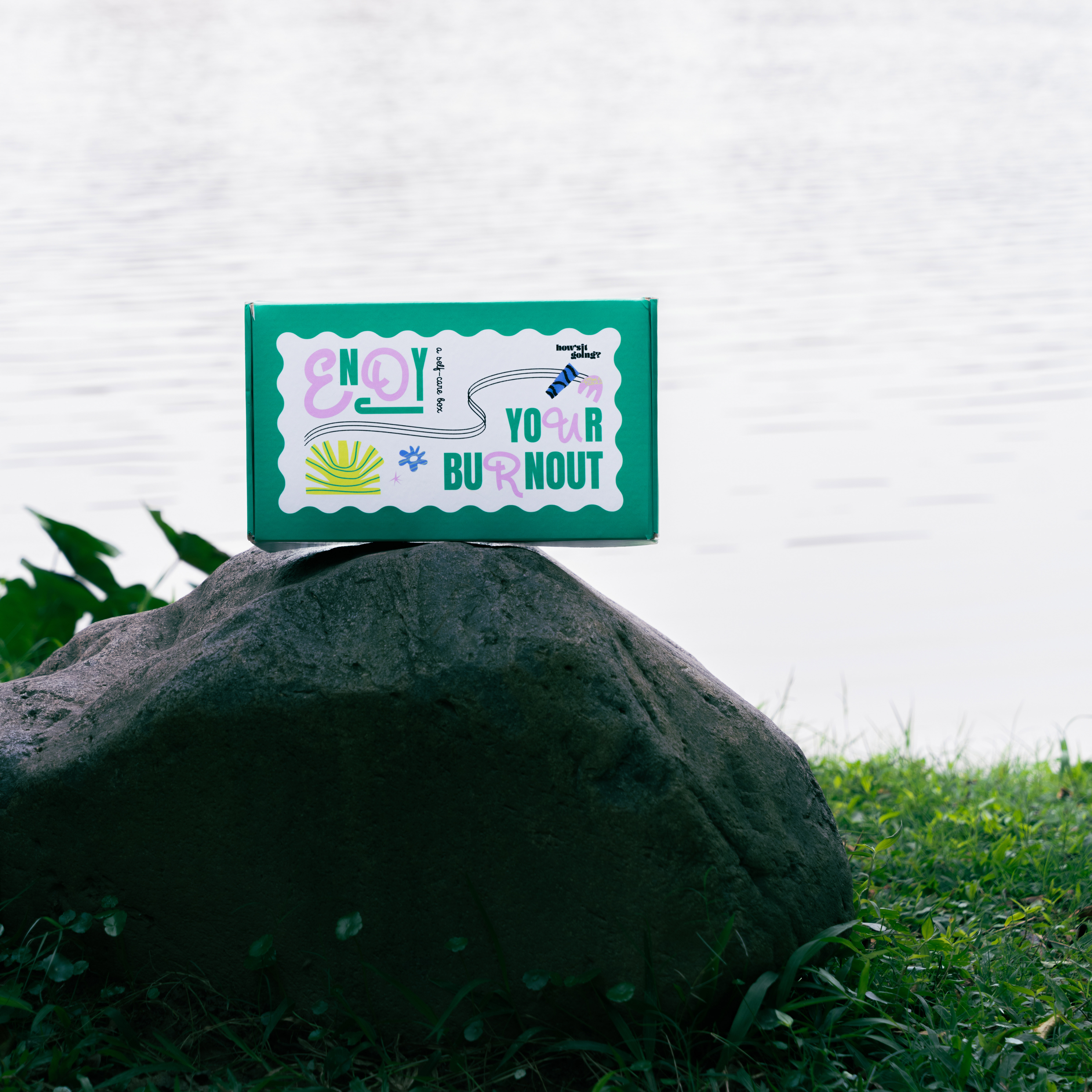
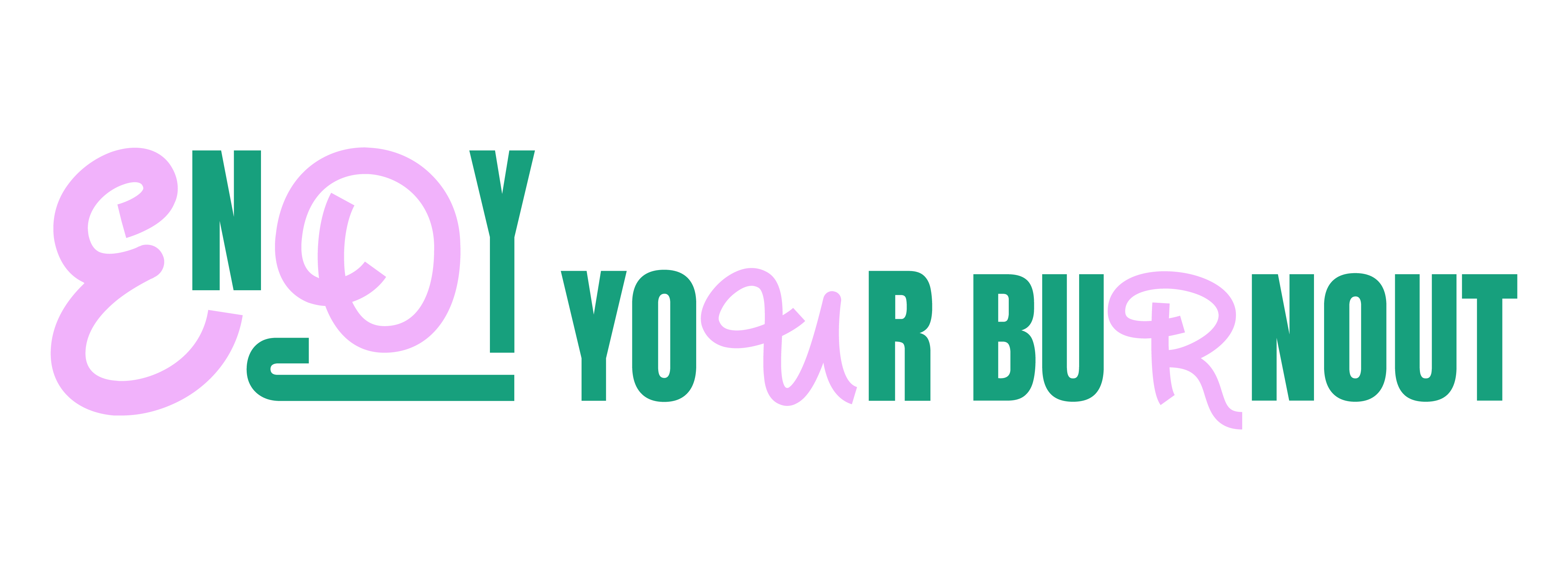
This CTA encourages Gen Zers to embrace intense emotional experiences, fostering self-understanding and self-awareness over fear and ignoring.
With the aim of connecting with GenZ in an approachable way through friendly design with healing vibes without clinical themes.
Overview
“How’s it going?” is a project that supports Gen Z in overcoming burnout via the conception and design of an appealing visual campaign. The campaign’s name is another way to say, How are you? How are things progressing? Generally, those who ask expect a positive response, which is why this name serves as a friendly request to users.
Target Audience
• Gen Z, who are around 18–25, expects to have a work-life balance.
• Those who are smashing mental health stigma, which is a psychological barrier generated by avoidance, rejection, and prejudice.
• People who want to get out of burnout.
OBJECTIVES
The goal was to develop an intriguing visual style for the young audience. This would encourage them to practice self-care, reflect on their mental issues, and learn about ways they could apply to improve their work-life balance on their own.
Creating a comfort zone that is stigma-free where the target audience has a sense of chill-out feeling to express their emotions without fear of judgement.
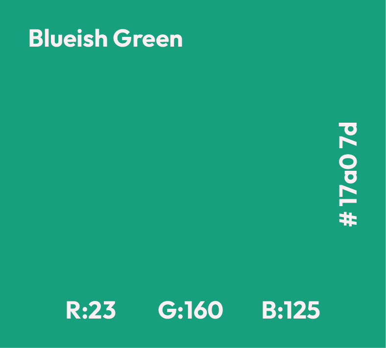
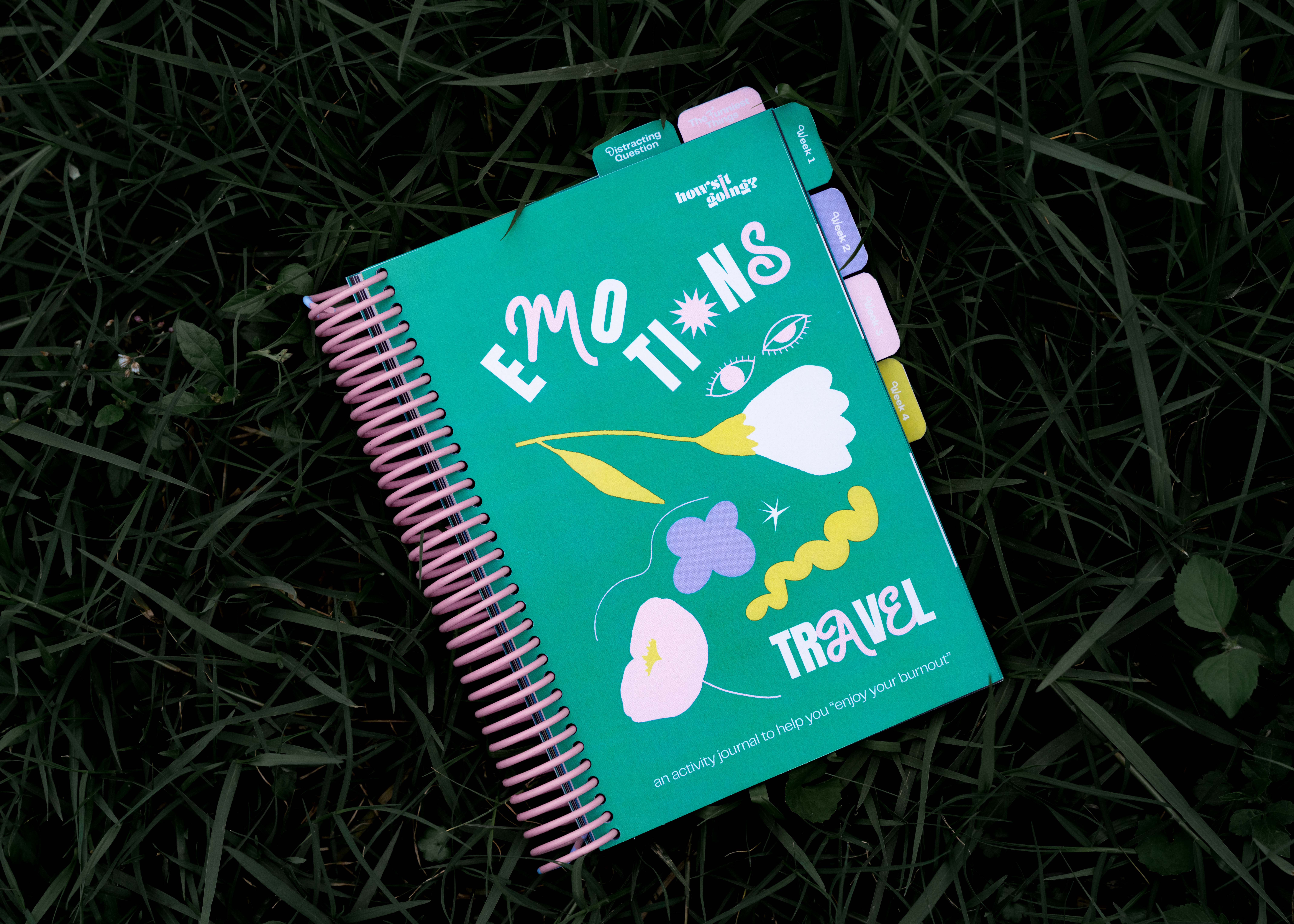
Bluish Green, a medium-dark-bright shade of Ocean Green with medium brightness and moderate saturation, is the primary color utilized in the campaign.
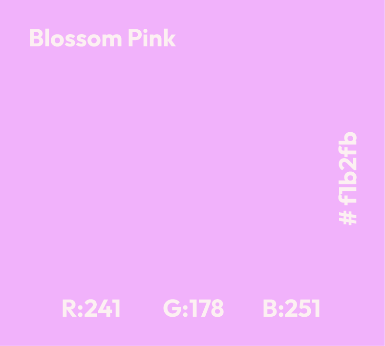
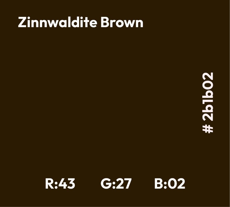
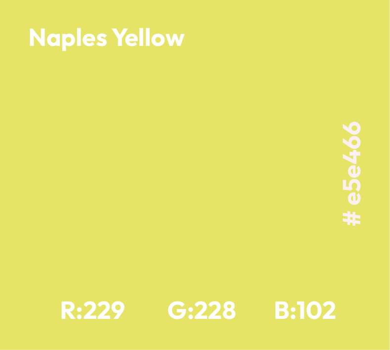
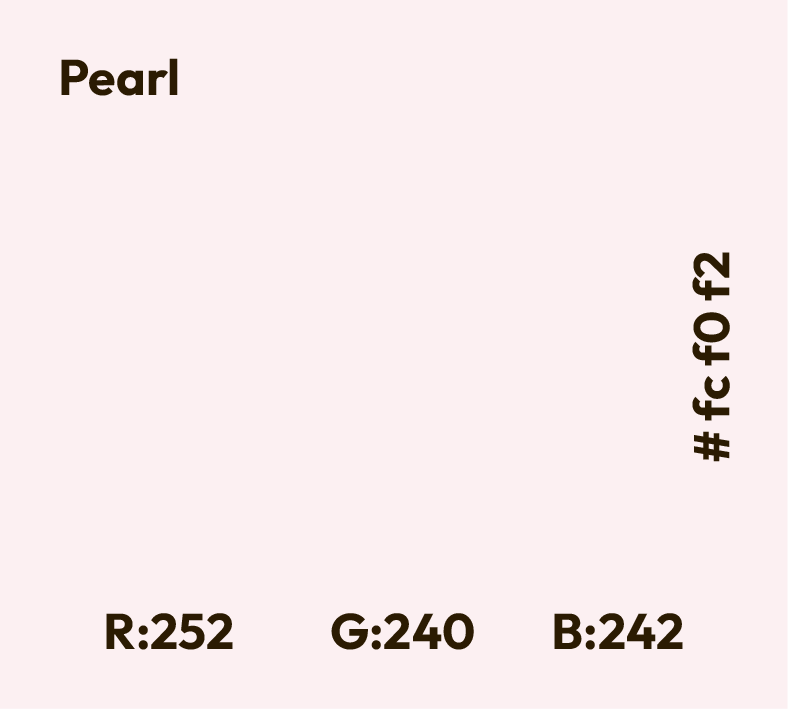
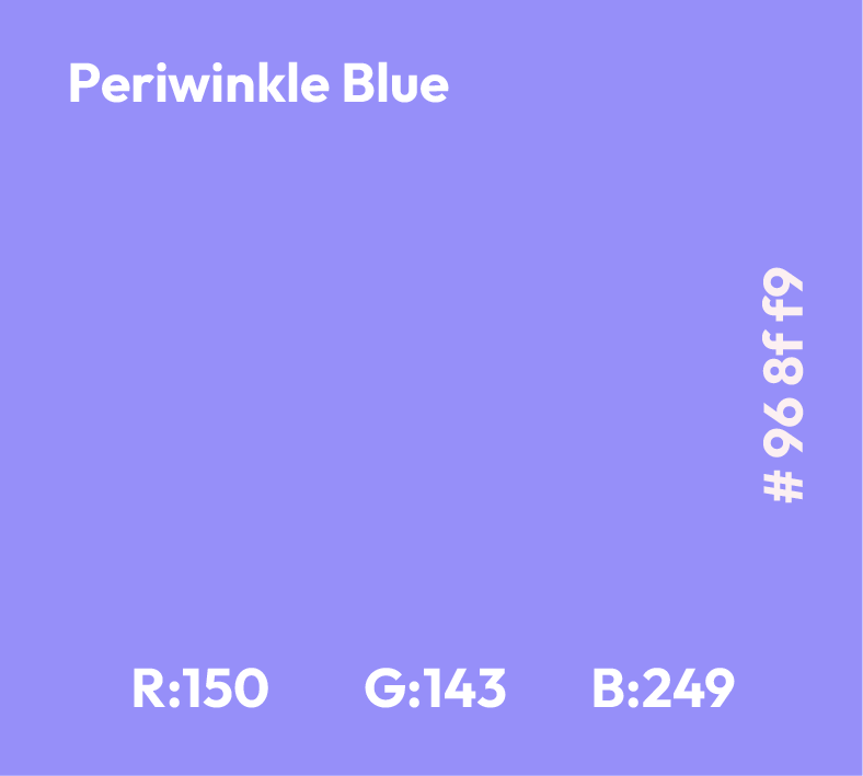
A colour set was also designed as a supplementary colour palette to match the campaign core color: Bluish Green is paired nicely with Blossom Pink, a soft pastel magenta shade. The project’s aim is healing, yet it still requires some vibrancy and joyfulness of creative expression to attract the target audience.
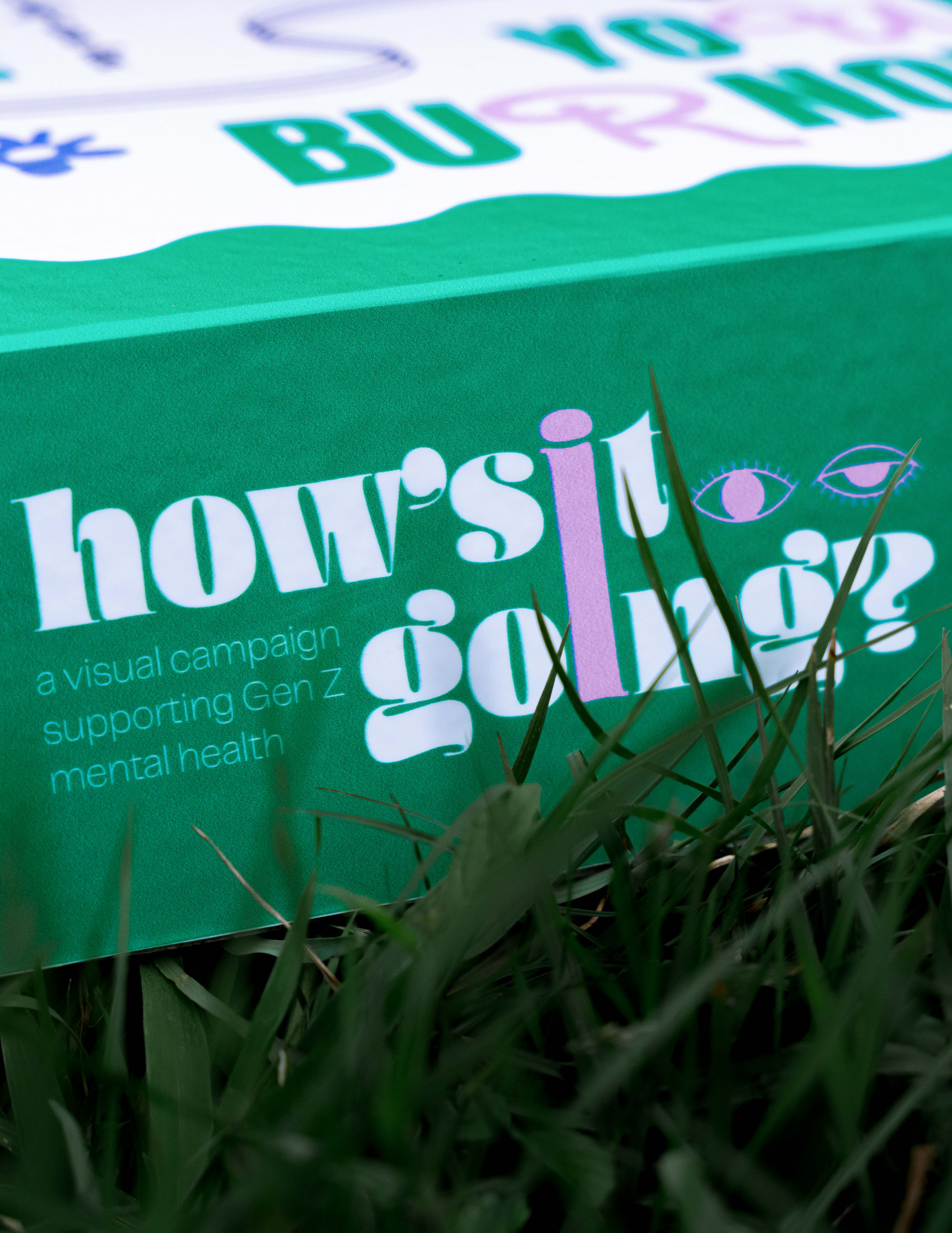
The logo features lowercase letters and a bold, rounded typeface, reflecting the project's core concept. Besides, the couple of eyes was created as a logo symbol to present the two typical emotional states: one side is awake and the other is fatigued, which is relative visually to the Gen Z working situation. While the typography brings a feeling of softness and links back to the idea of hoping for something positive, the eye shape gives curiosity about the audience, whether they are awake or fatigued.
LOGOTYPE
SYMBOL LOGO
FULL LOGO
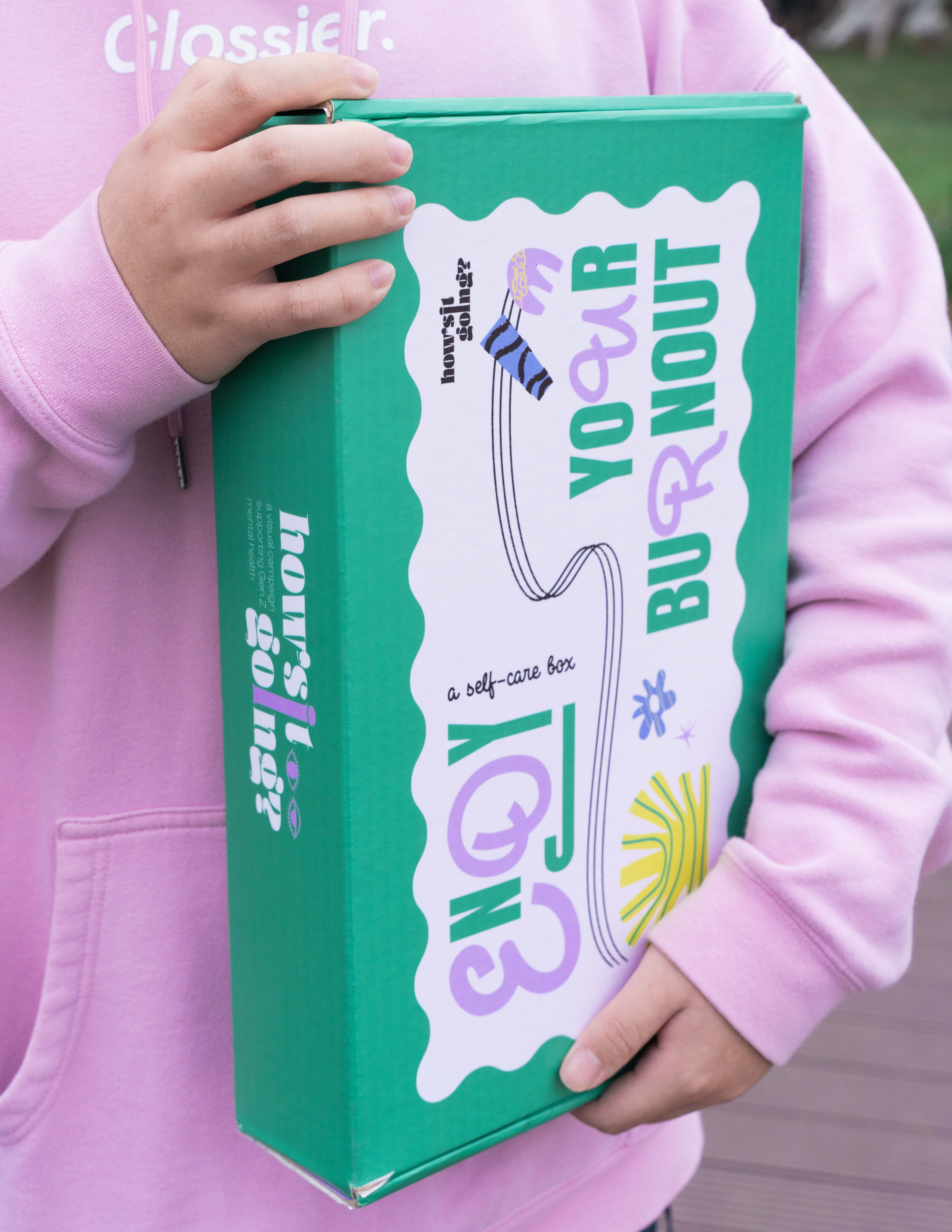
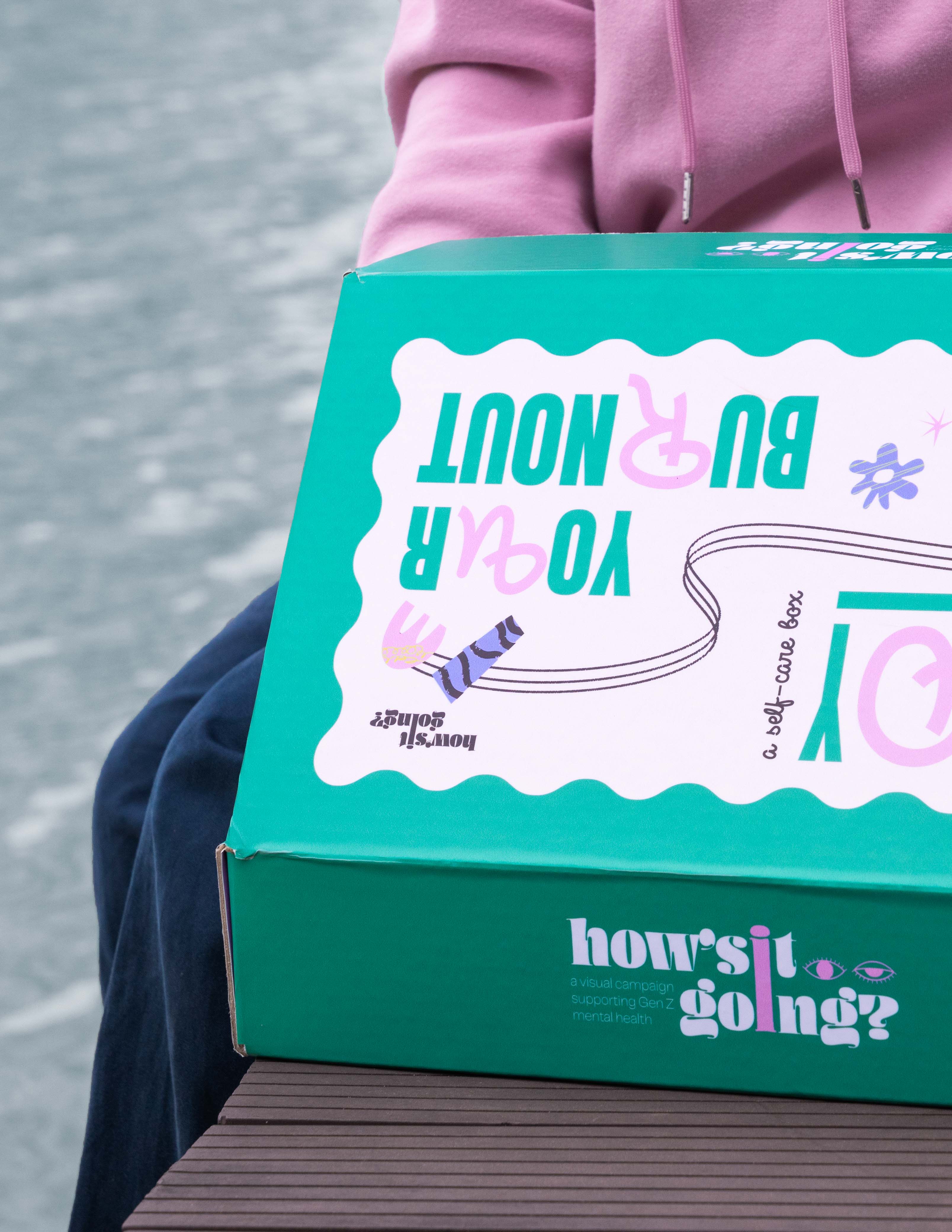
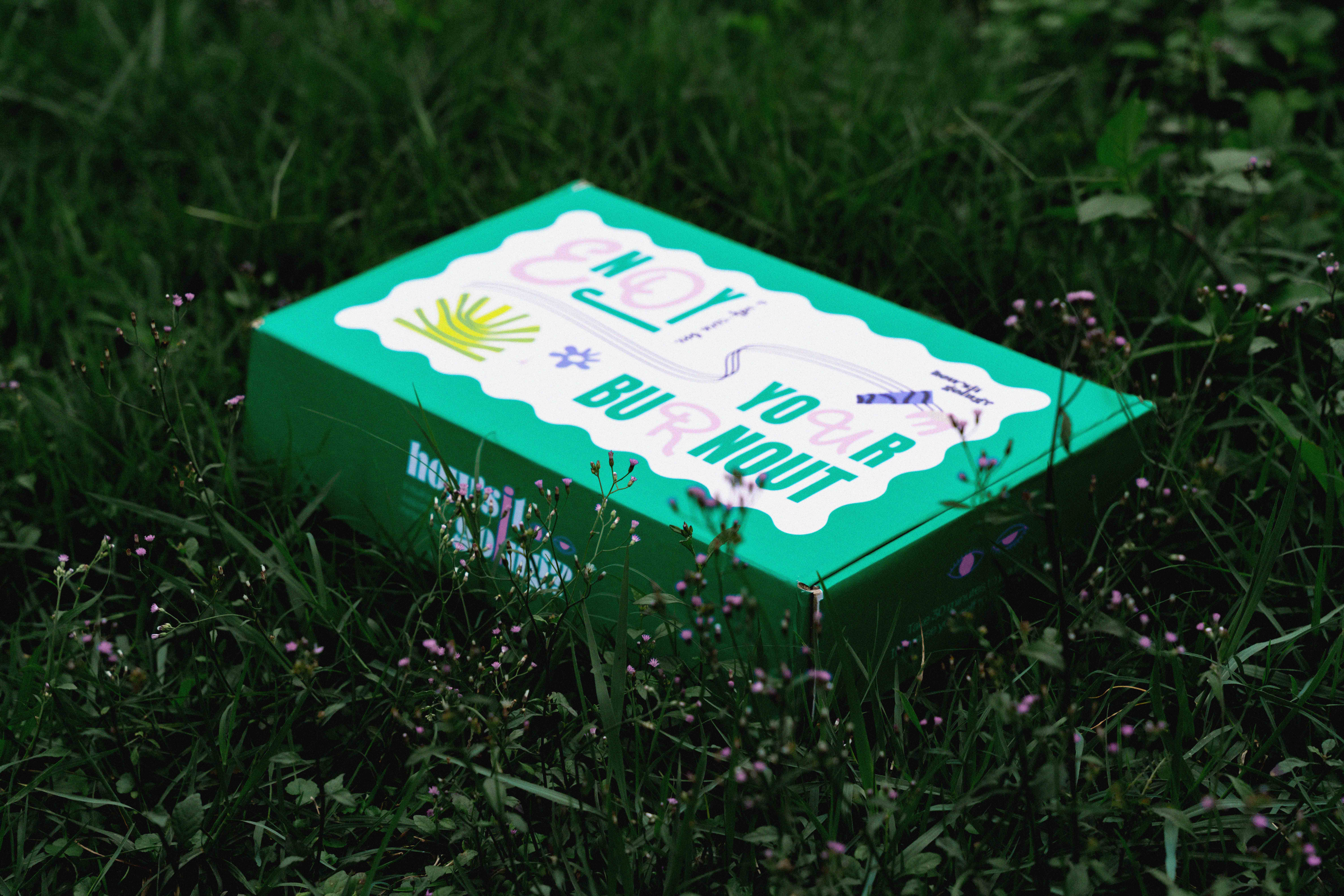
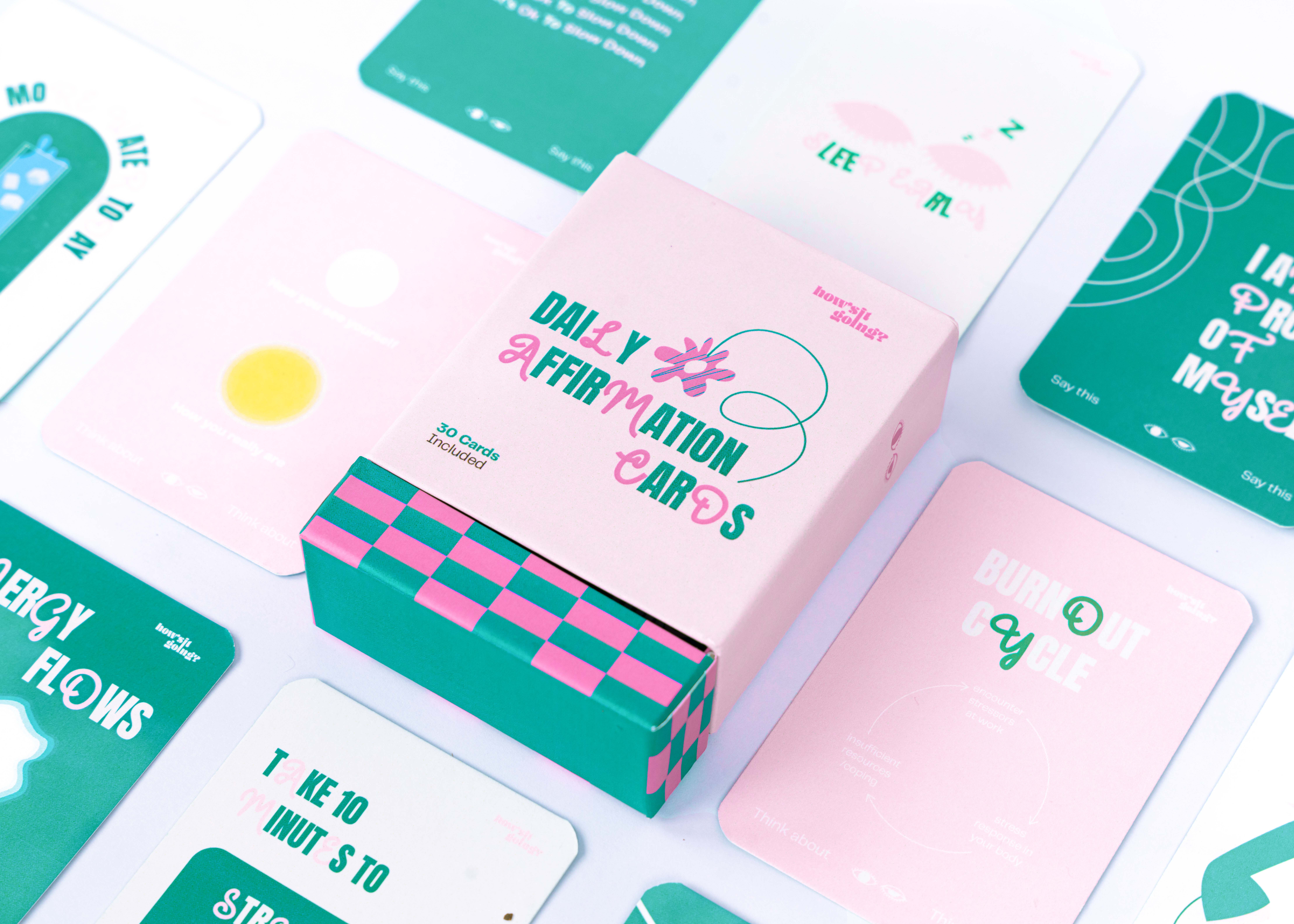
This campaign comes in a physical package. Different from conventional approaches, this box presents the user with a gift rather than medical supplies. All the things inside the box are suitable for the user’s state and do not lead them to hesitate when using them.
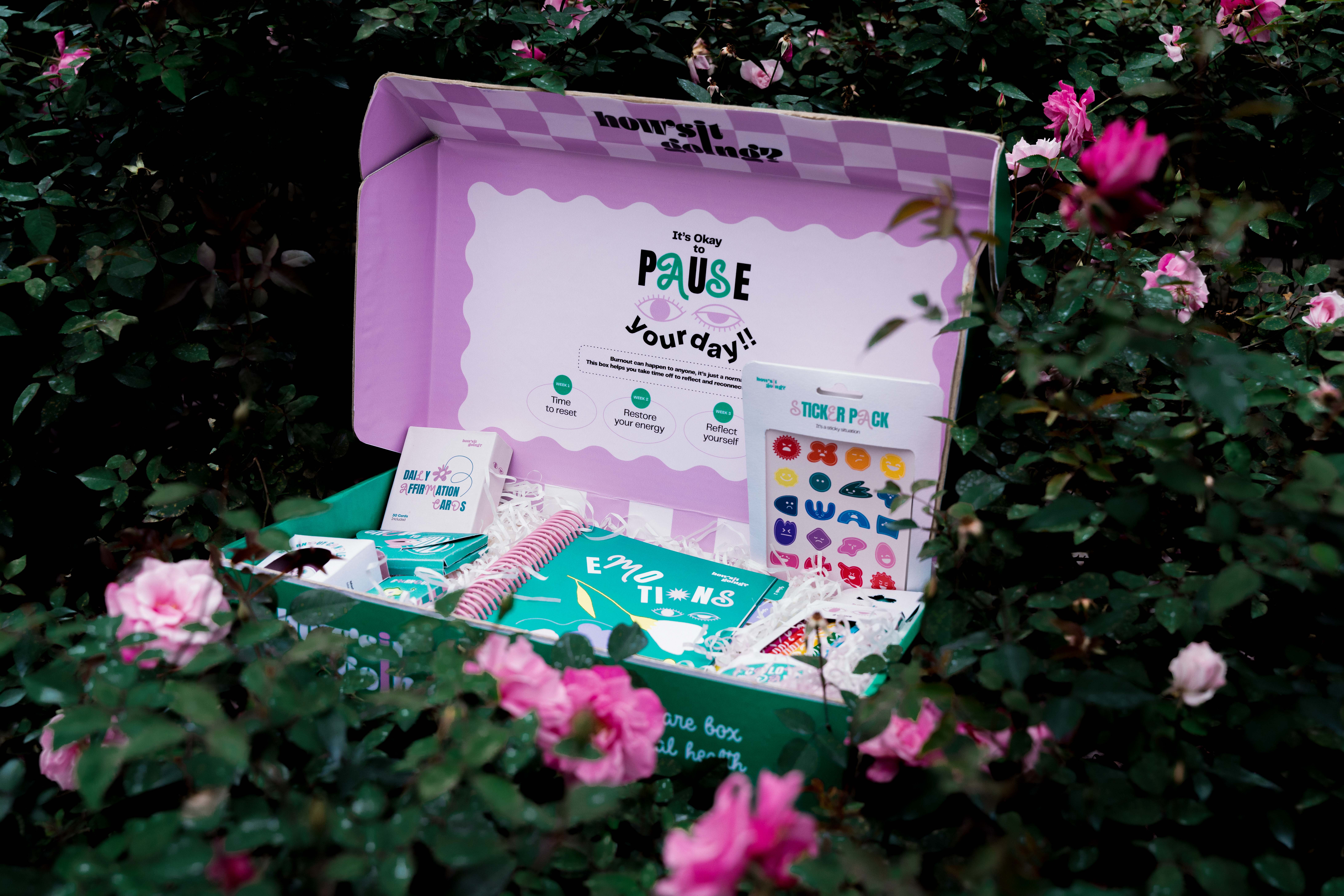
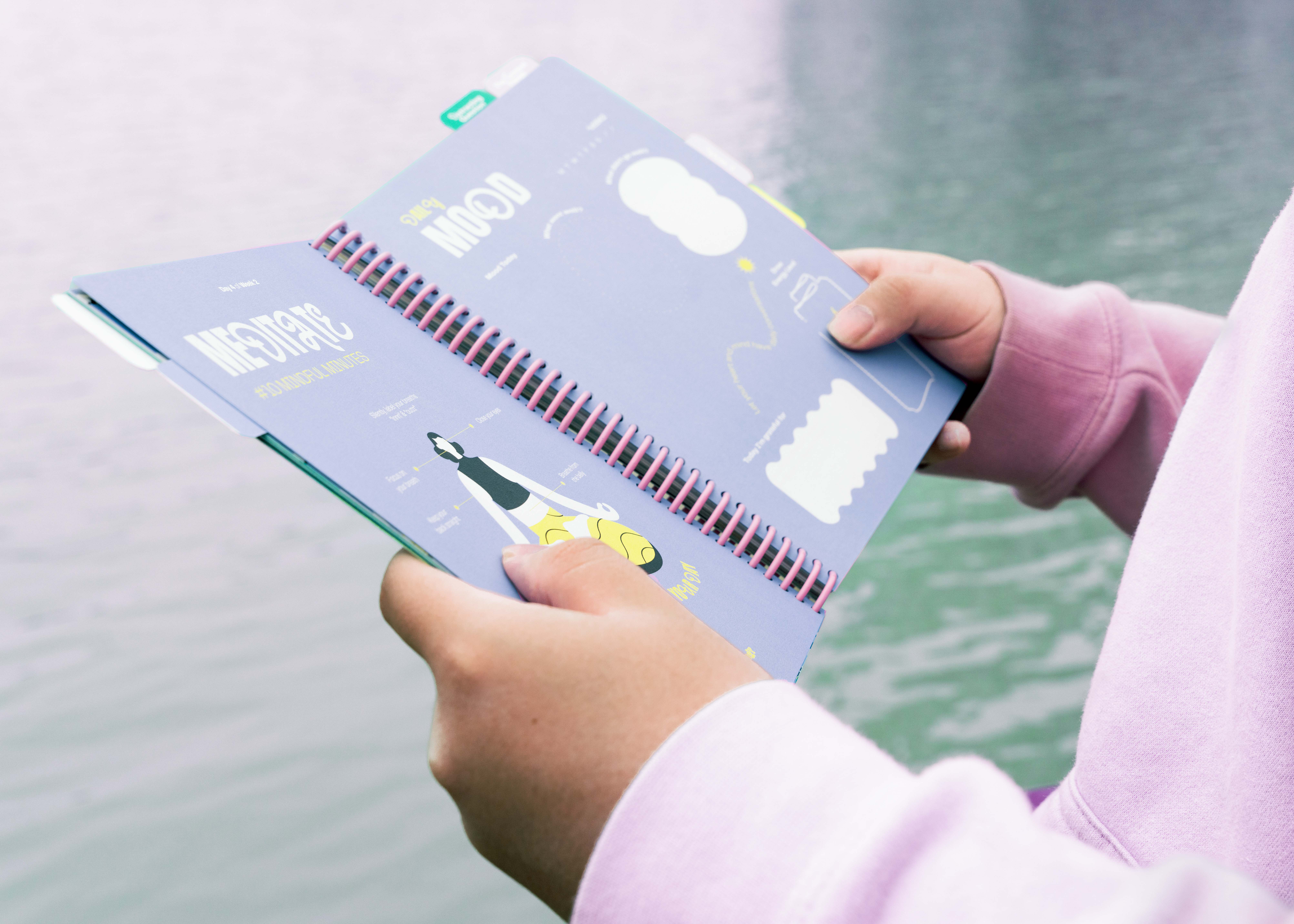
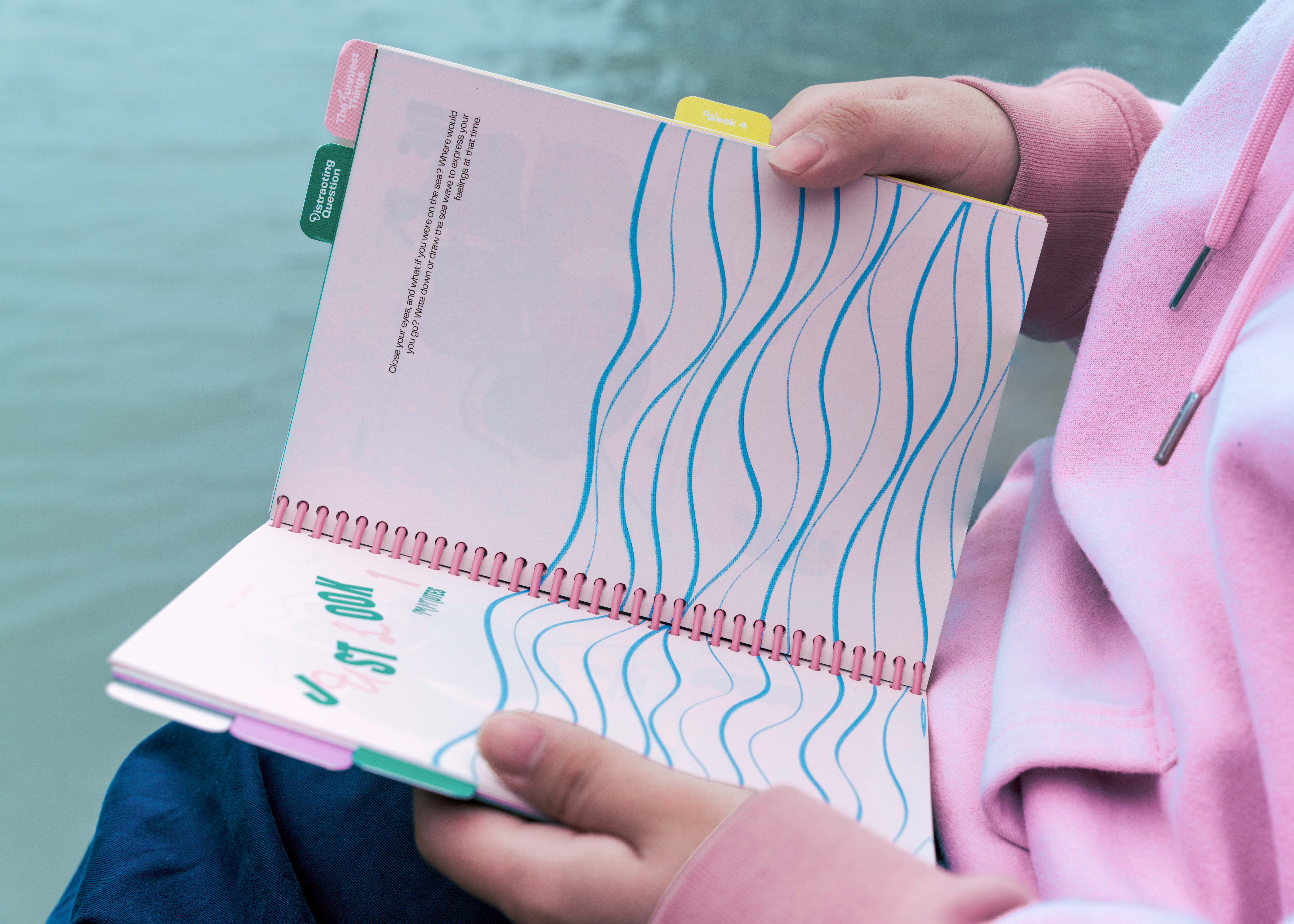
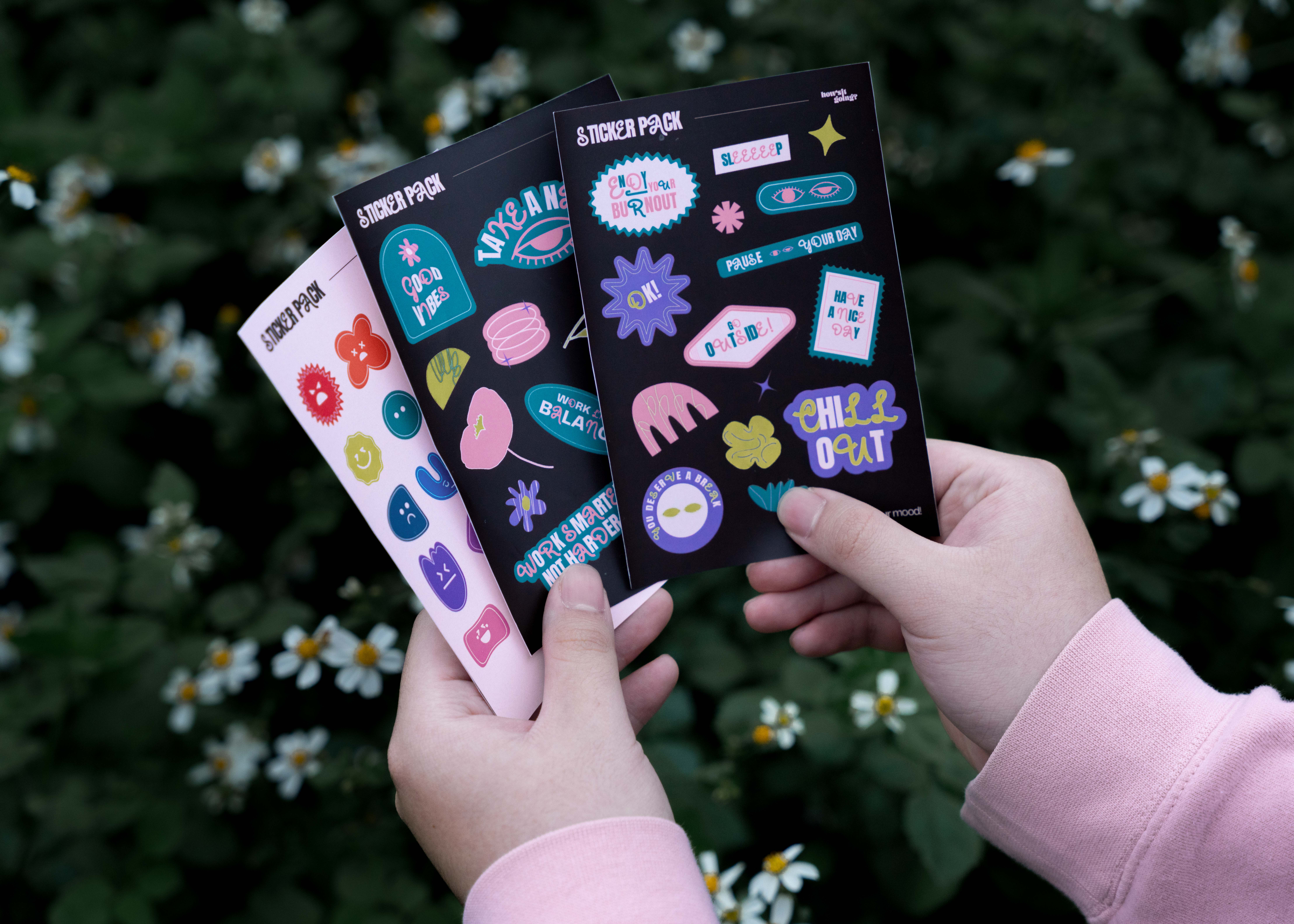
Each item carries a small activity that people can carry out with ease. The project expectation was to give the target user a friendly reminder, directions for the day, and a private space to reflect and express feelings.
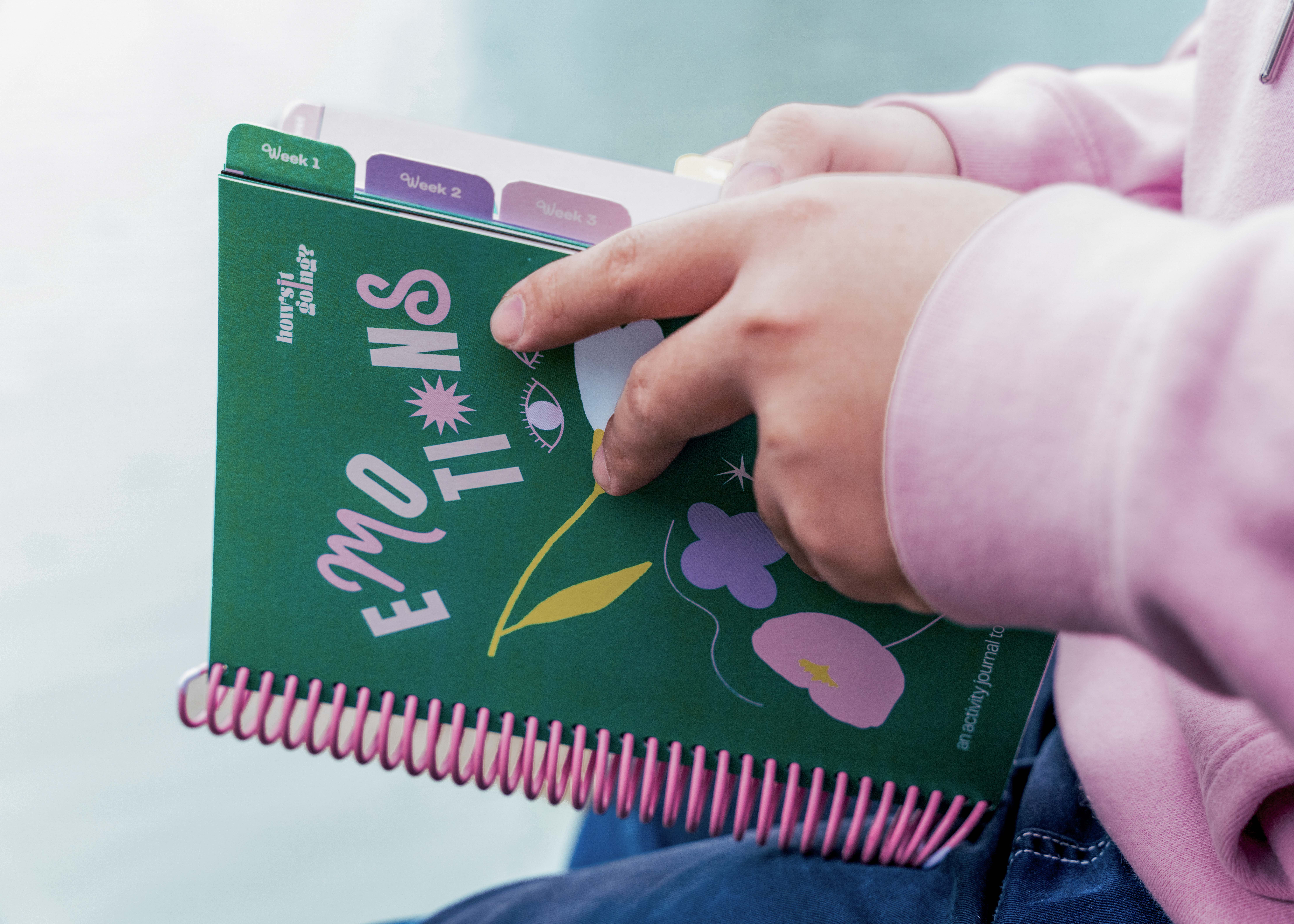
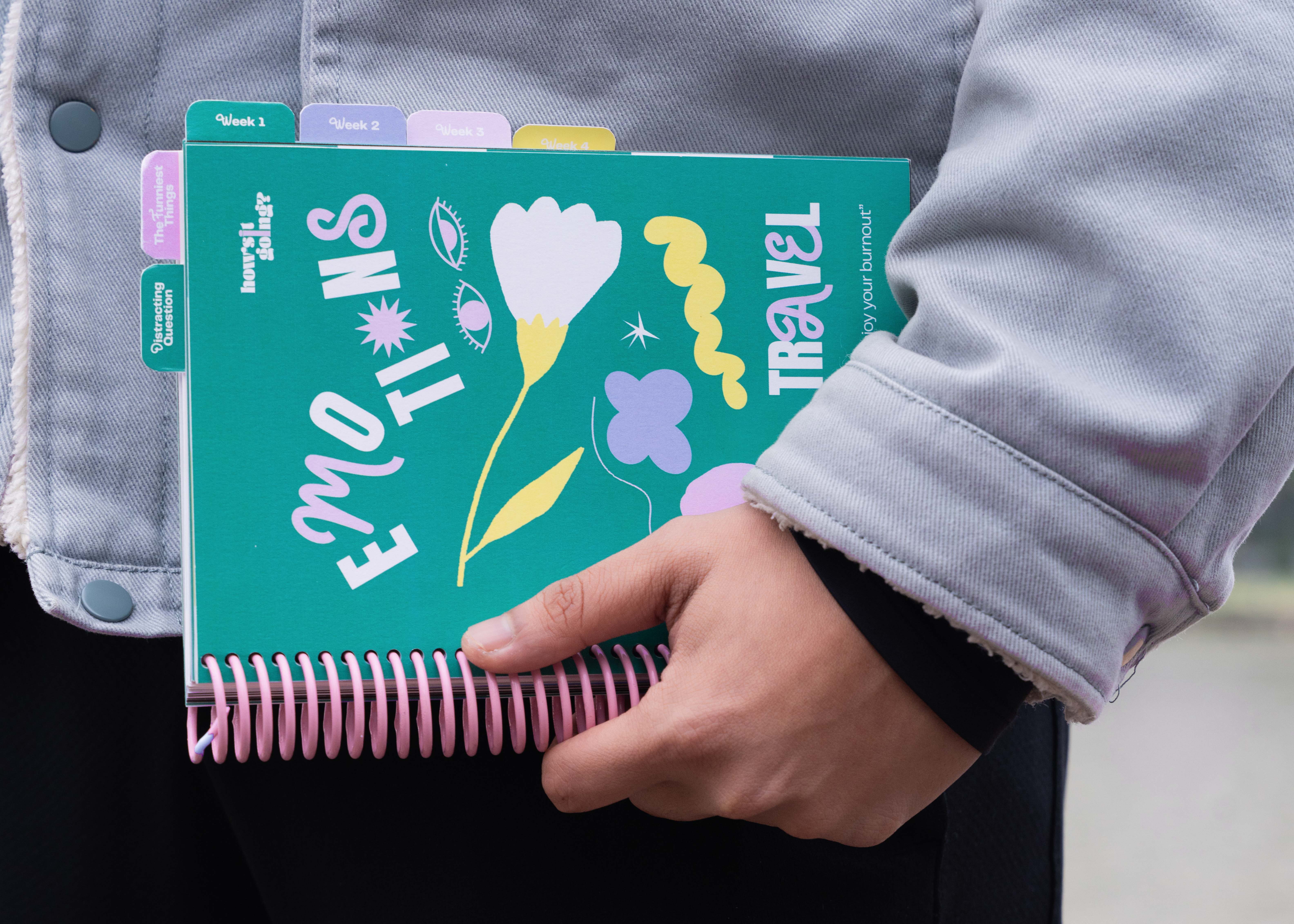
#Journal #Stickers
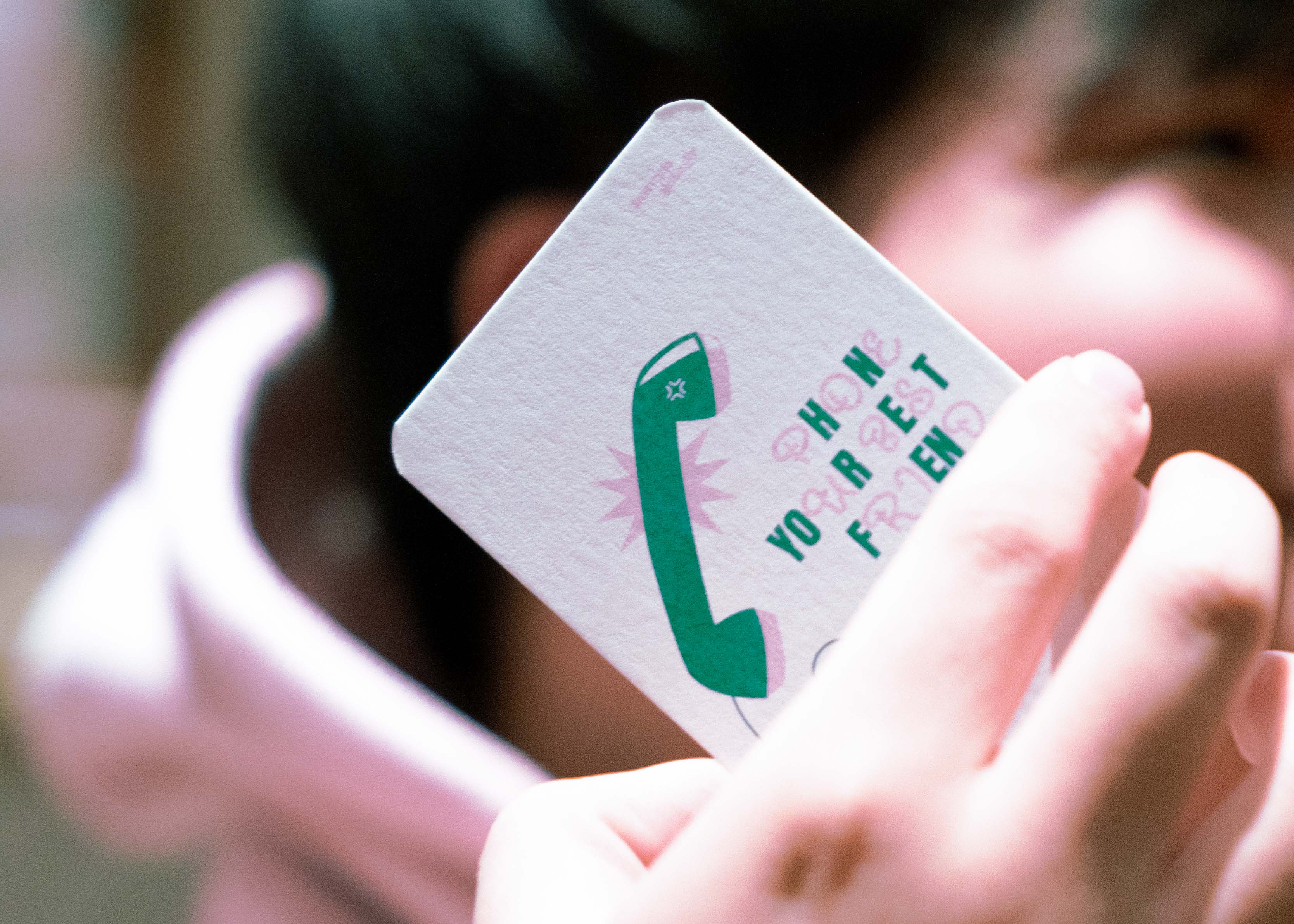
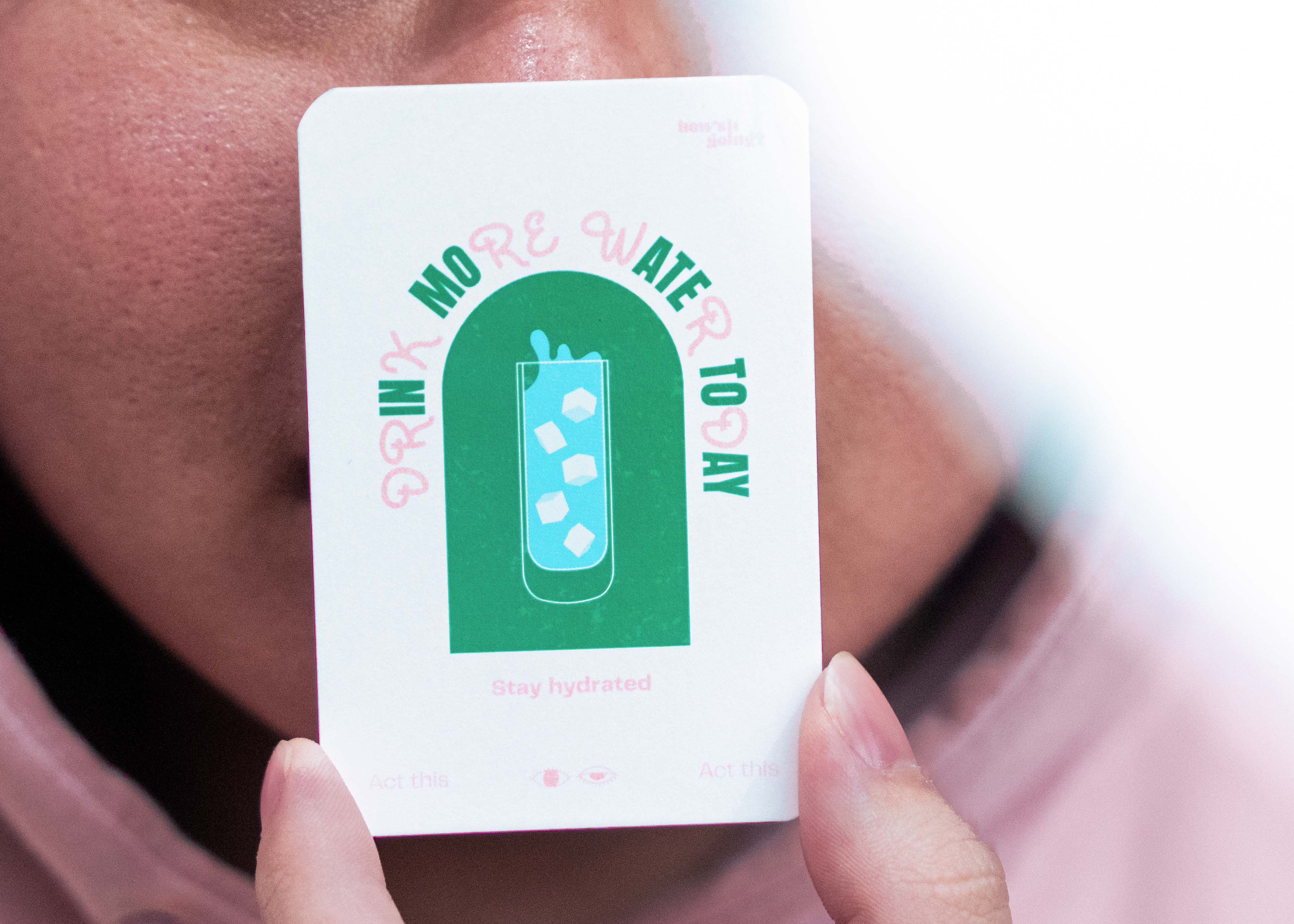
#Affirmation Cards
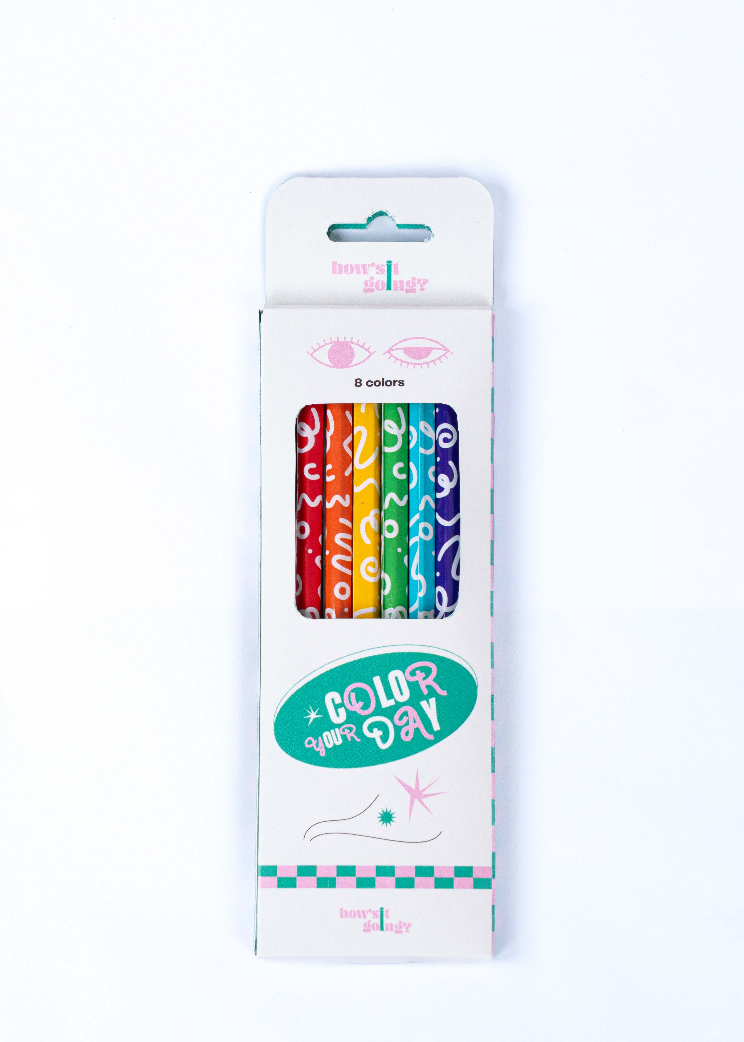
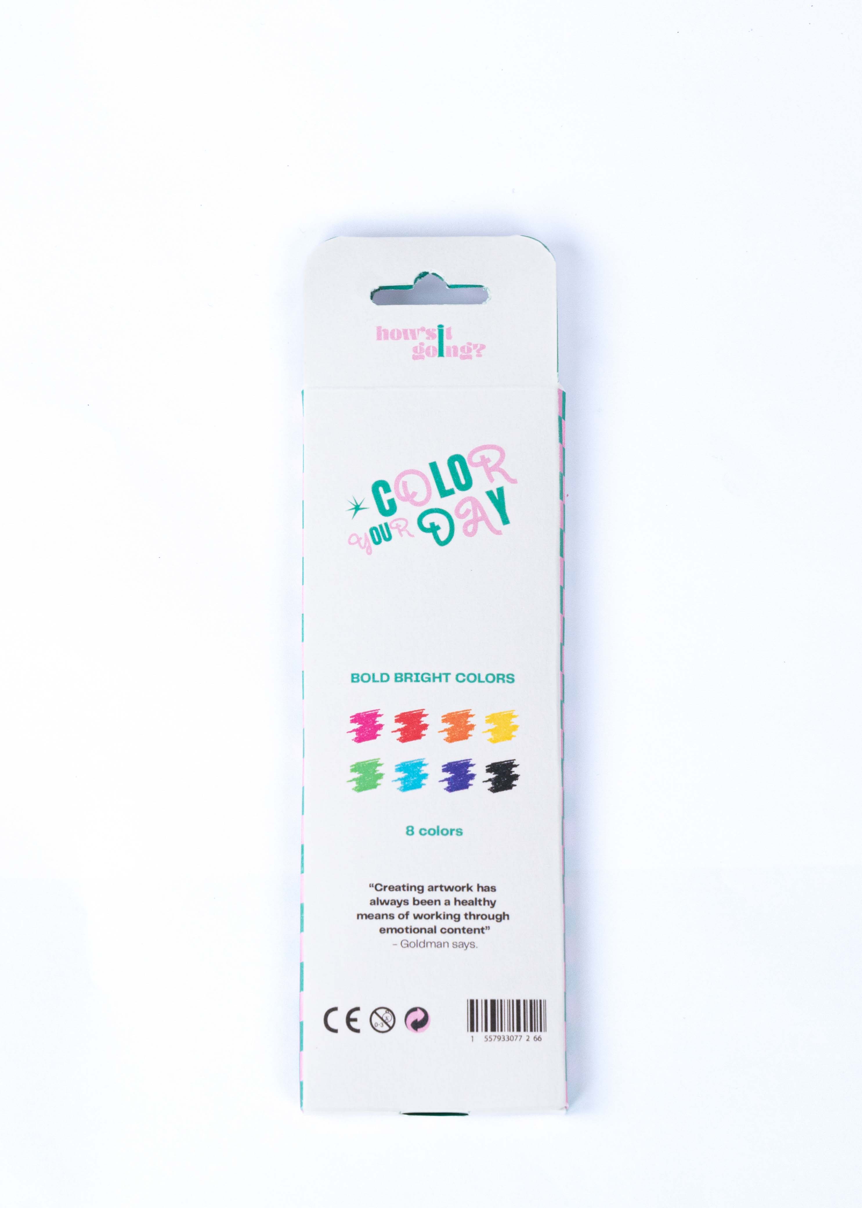
#Color Pencil
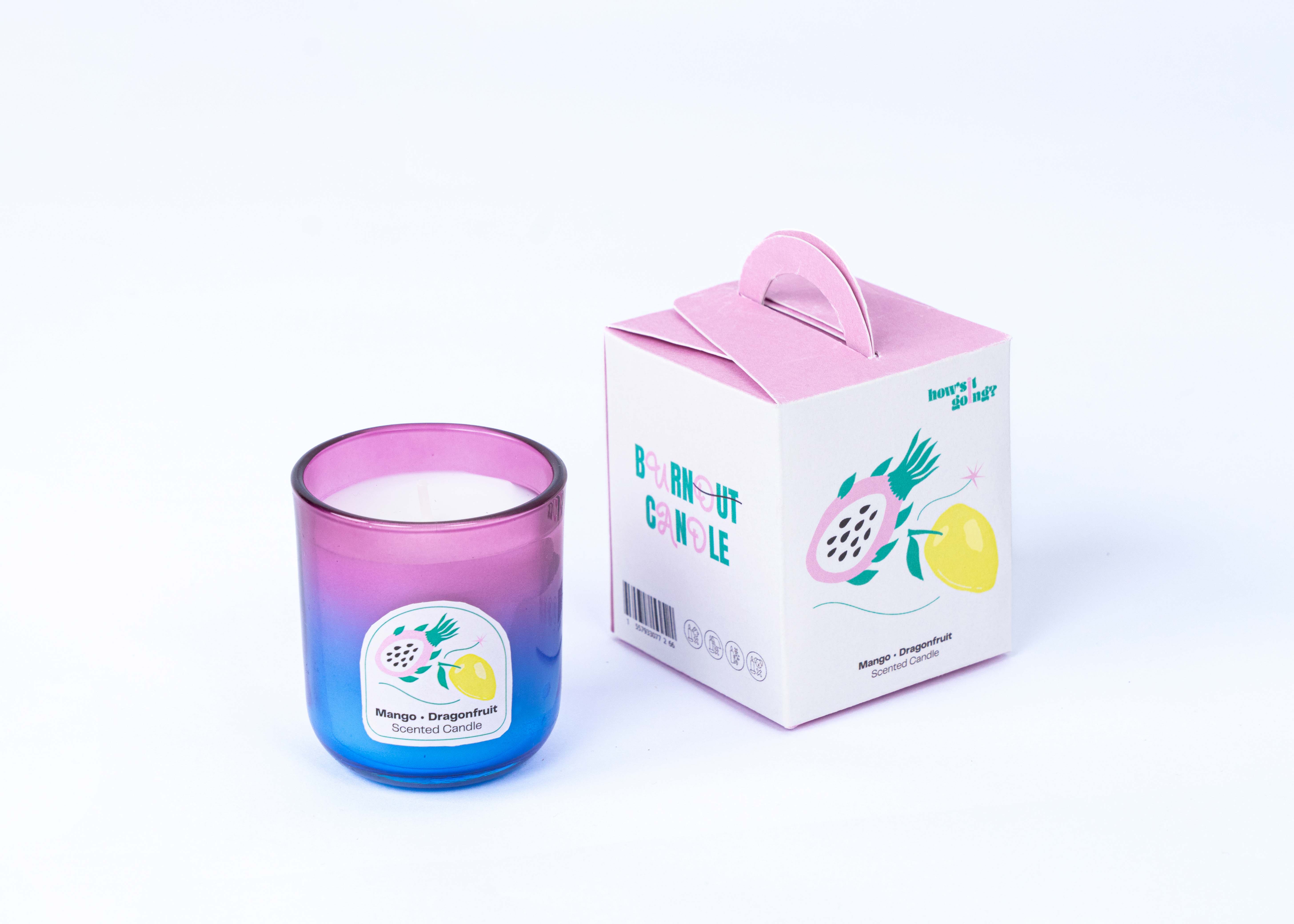
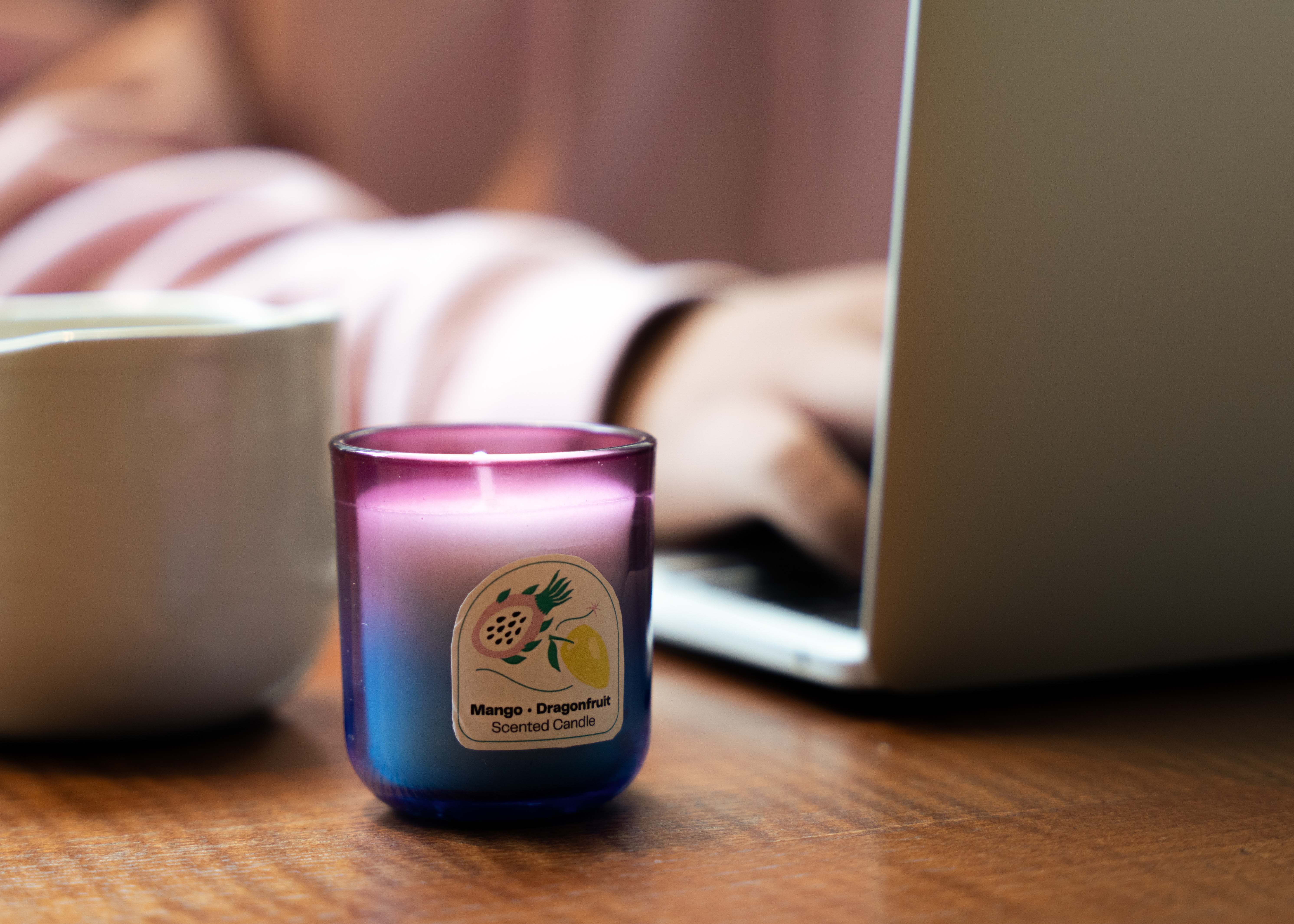
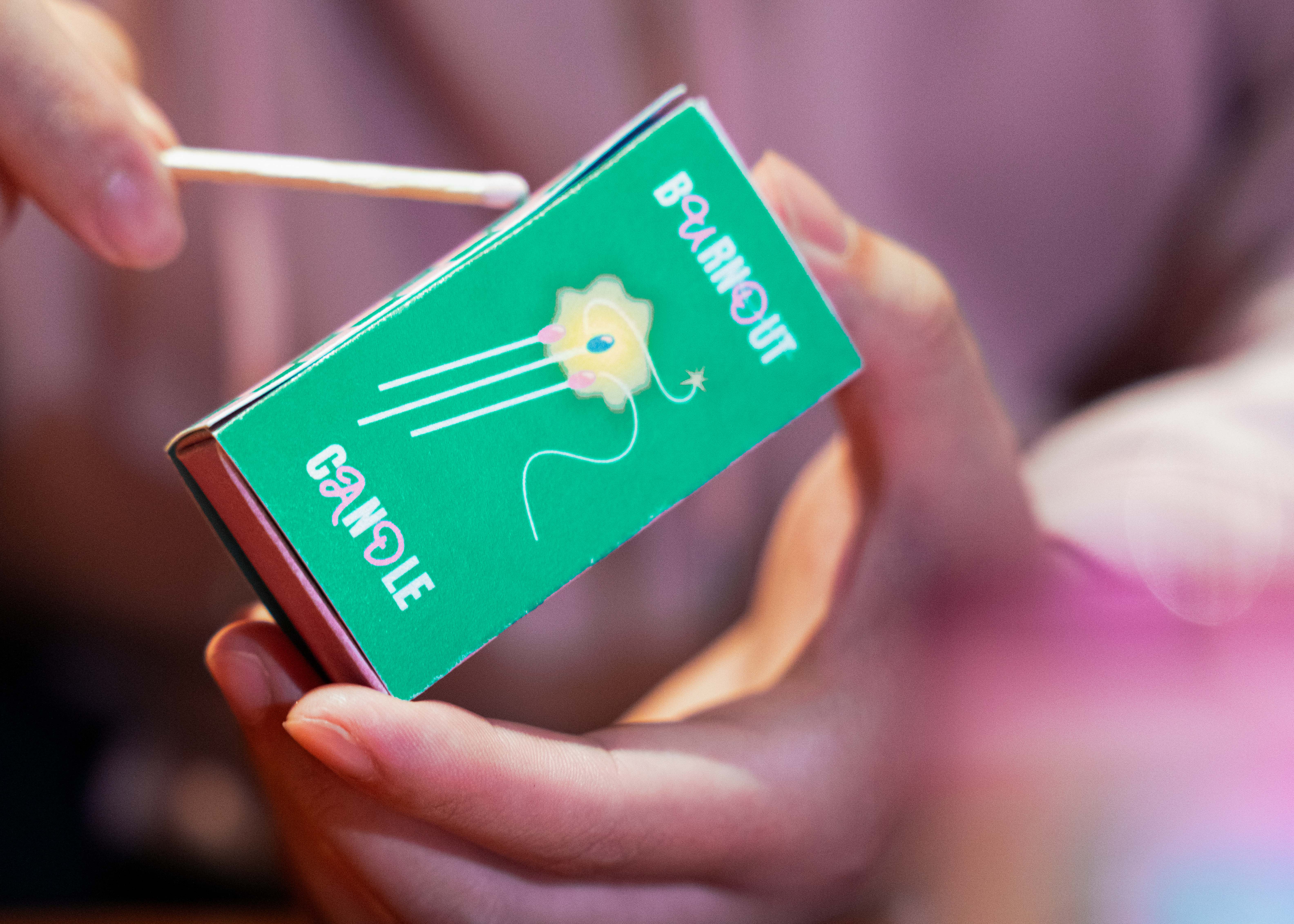
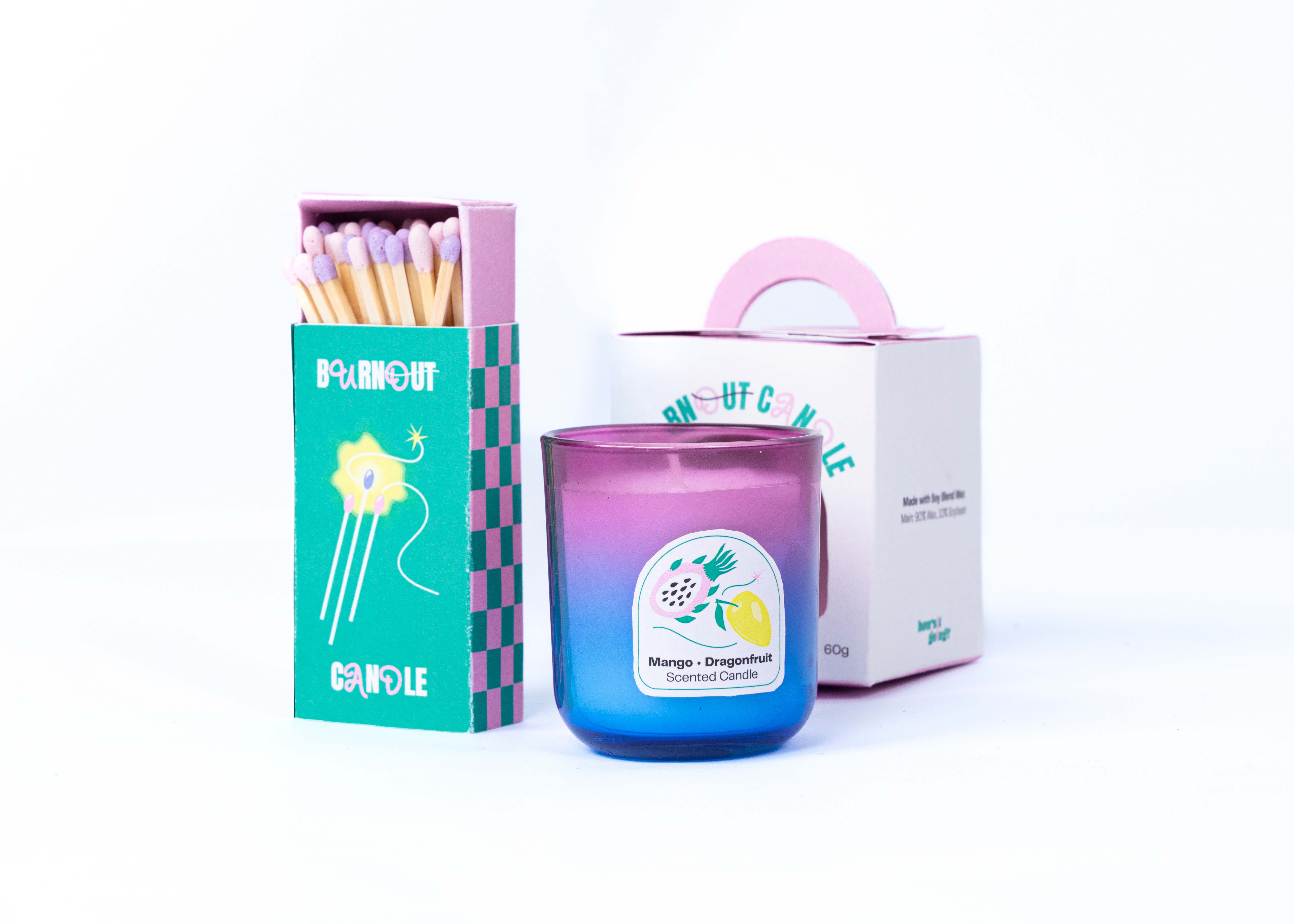
#Candle #Match Box
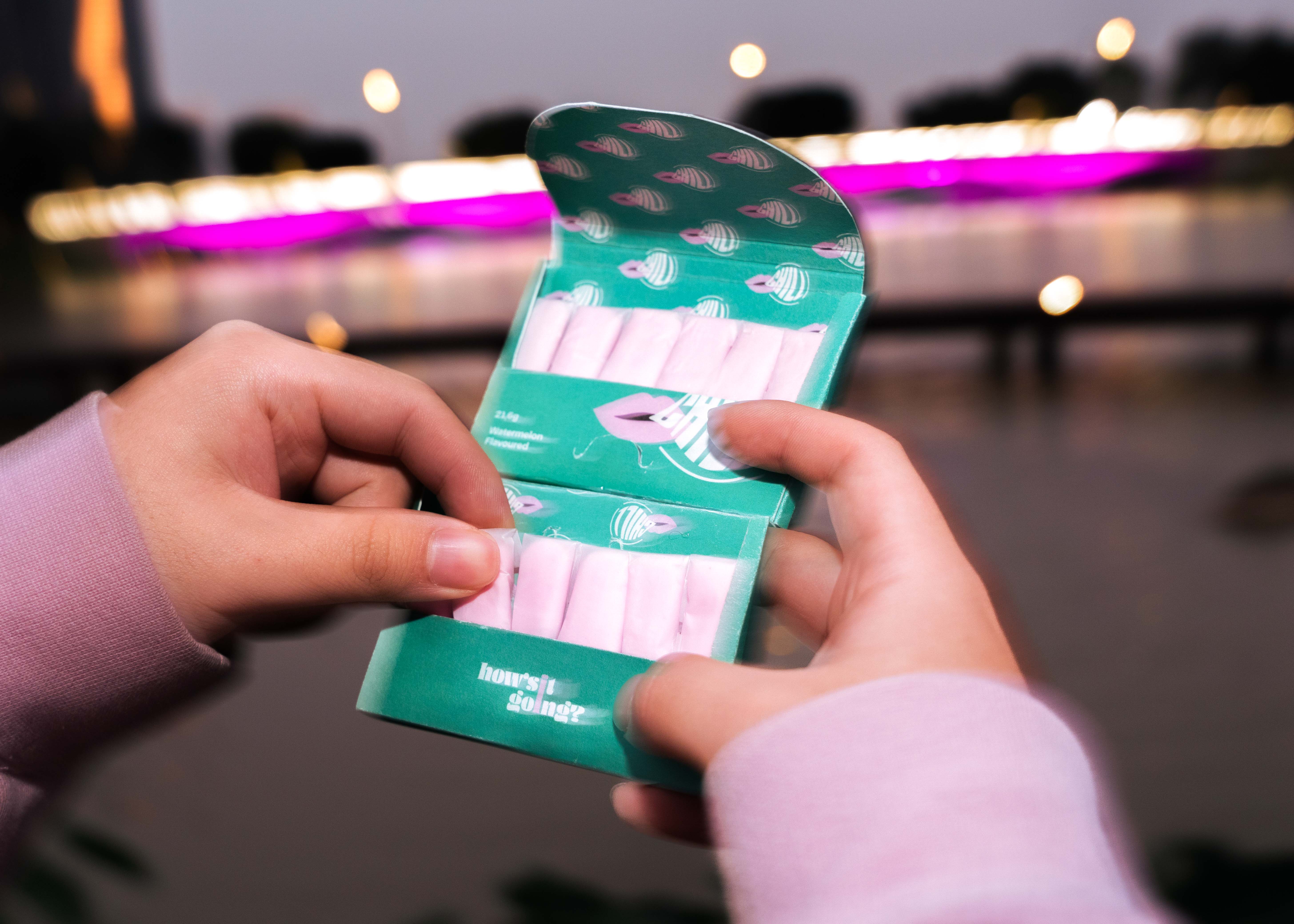
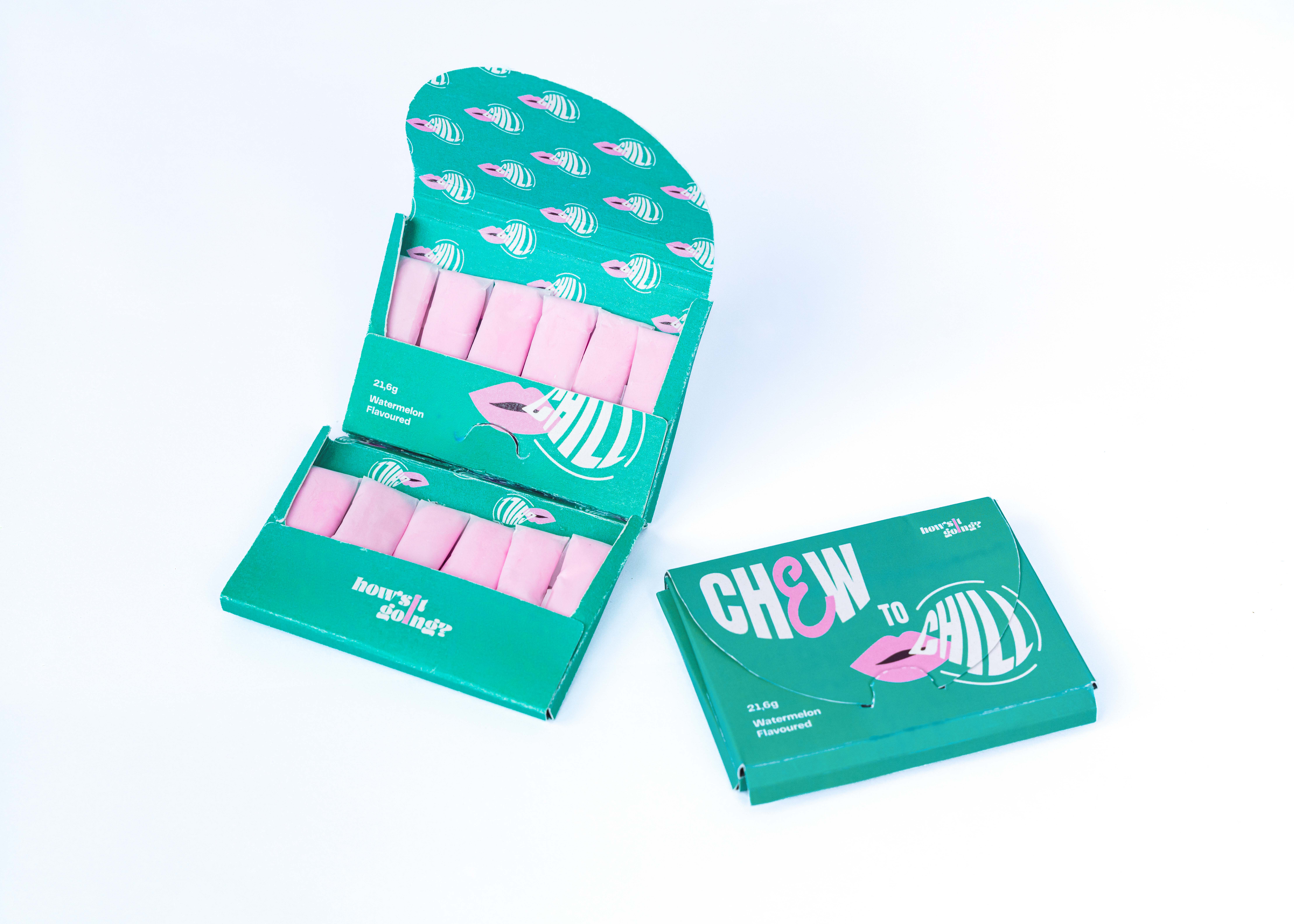
#Chewing Gum


Affirmation cards have a significant impact on the user’s mental health by reframingnegative thoughts and enhancing self-esteem.


Coloring is a good method to release tension. It soothes the mind and relaxes thebody. This can help with sleep and weariness while reducing physical pains, heartrate, breathing, and feelings of despair and anxiety. That is why the colour pencil boxwas included on the list of items.
